
The World Map According to Population
A fascinating cartogram reimagines the world map by reshaping countries according to their populations rather than geography. By turning data into visual form, it offers a striking perspective on where people truly live across the planet.
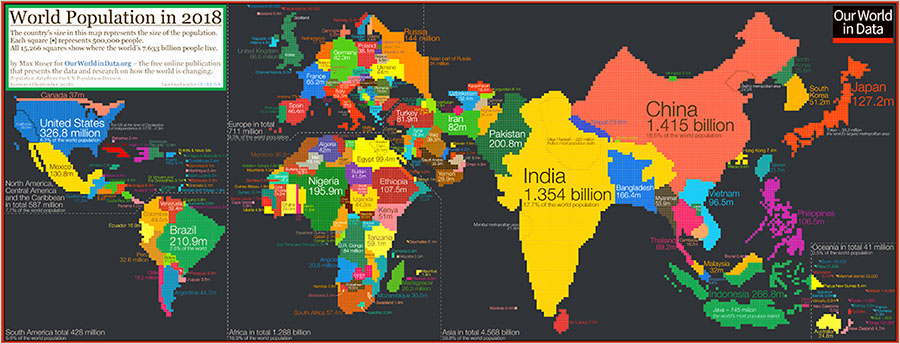
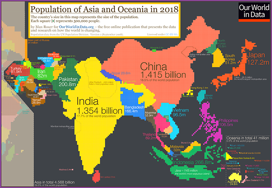
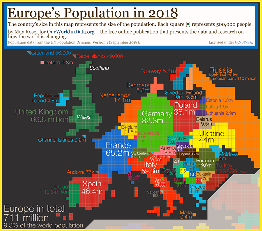
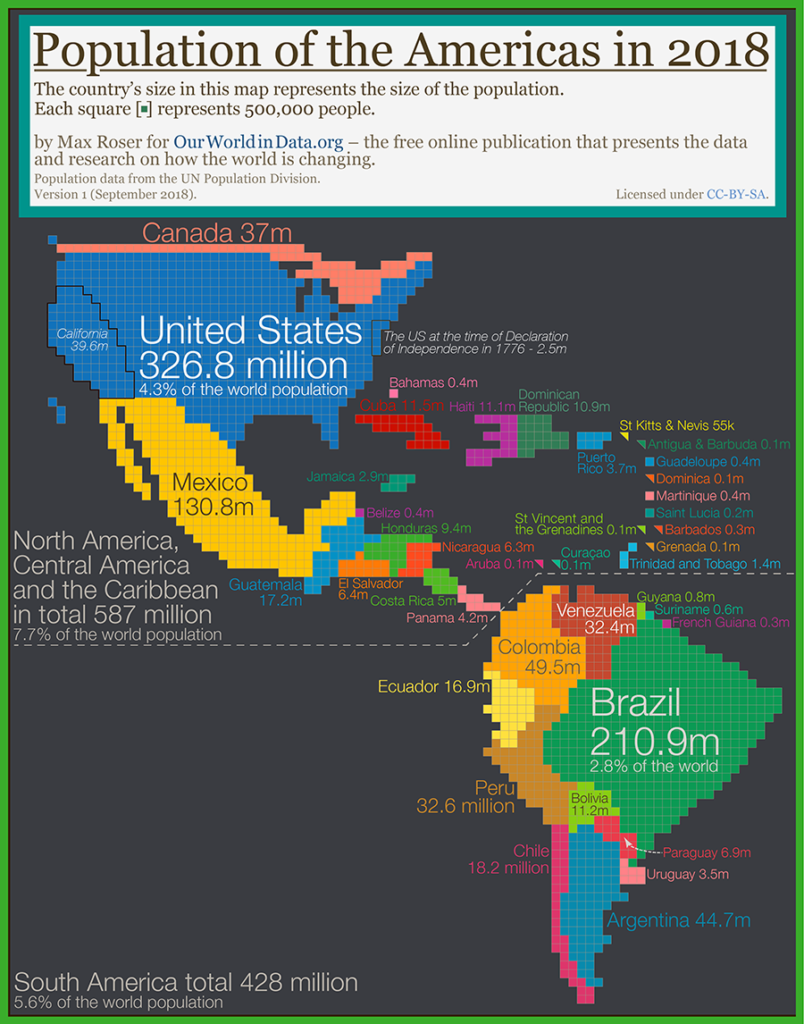
A typical world map shows us the basic geography of countries and continents, but it doesn’t give any indication of where people actually live! To get around the challenges of relying on the standard world map, Roser instead has made a population cartogram based on 2018 population figures. A cartogram is a visualization in which statistical information is shown in diagrammatic form. In this case, it’s a population cartogram, where each square in the map represents 500,000 people in a country’s population. In total there are 15,266 squares, representing all 7.633 billion people on the planet.
via visualcapitalist
Recent Posts
Archives
- May 2026
- March 2026
- May 2024
- April 2024
- March 2024
- January 2024
- October 2023
- July 2023
- June 2023
- March 2023
- December 2022
- November 2022
- October 2022
- September 2022
- August 2022
- July 2022
- June 2022
- May 2022
- April 2022
- March 2022
- February 2022
- January 2022
- December 2021
- November 2021
- October 2021
- September 2021
- July 2021
- June 2021
- May 2021
- April 2021
- March 2021
- February 2021
- January 2021
- December 2020
- November 2020
- October 2020
- September 2020
- August 2020
- July 2020
- June 2020
- May 2020
- April 2020
- March 2020